
- Best Seller

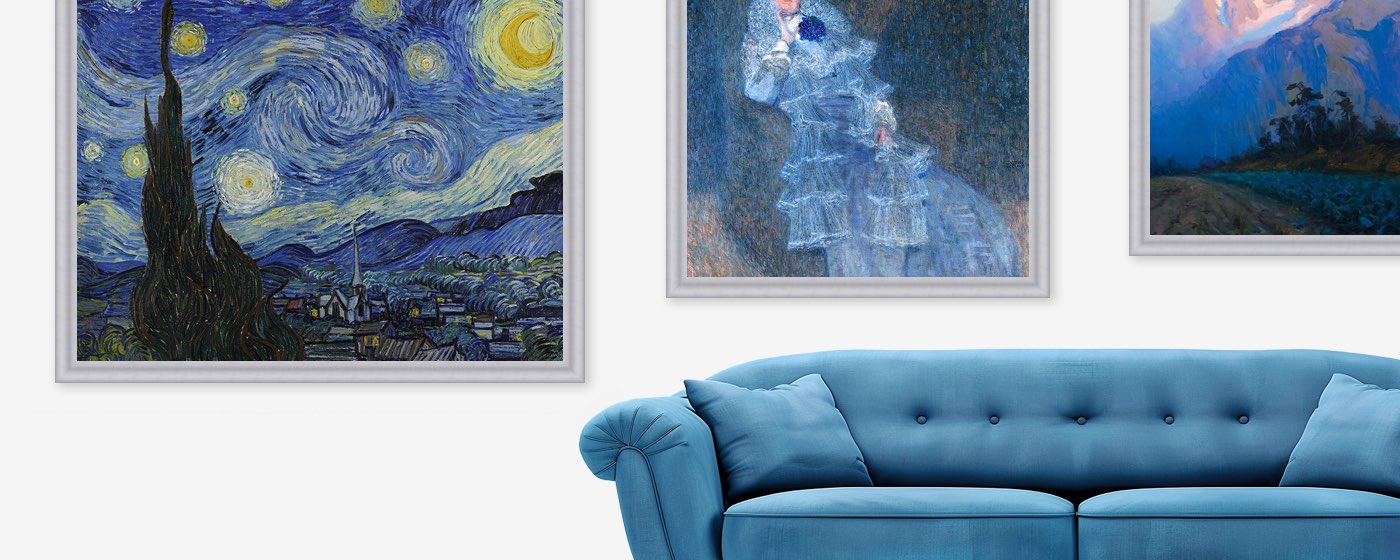



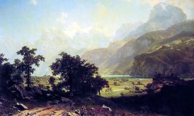

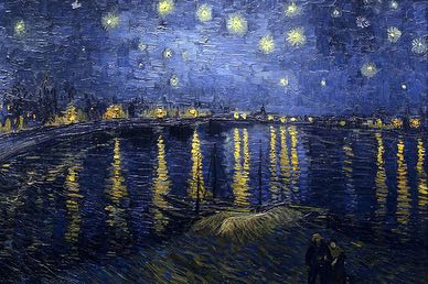
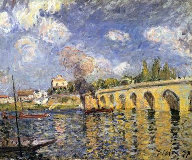
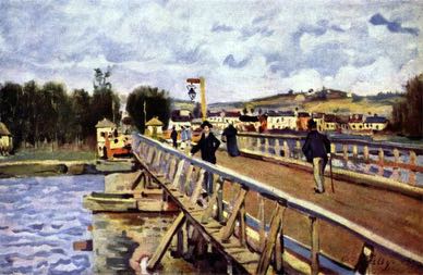
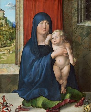
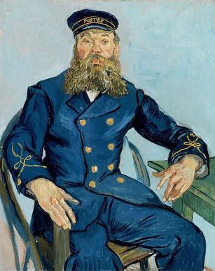
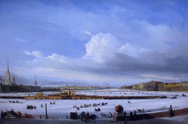

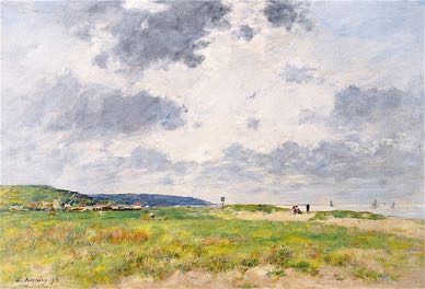
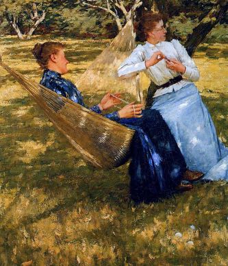


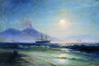


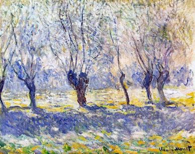
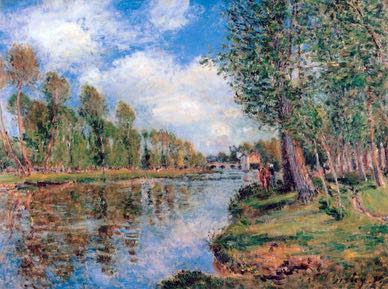
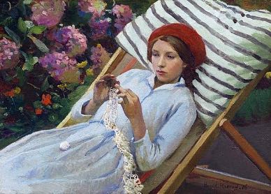
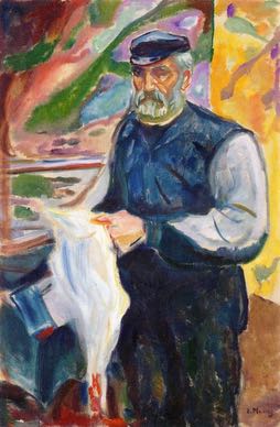


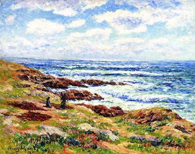



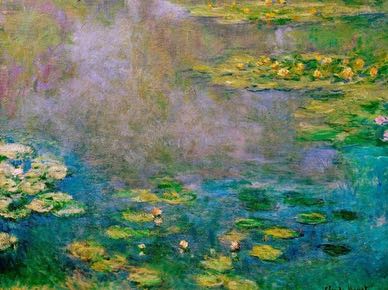
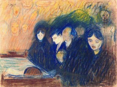
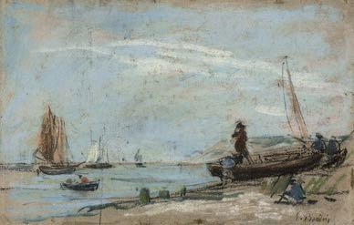

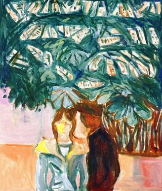
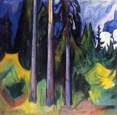


Looking for a specific painting that isn’t in our catalog? Just let us know. We can recreate almost any artwork in the size and style you’re looking for.
Request a PaintingBring the color and atmosphere of blue paintings into your space with a reproduction painted entirely by hand. Our collection features thousands of blue-themed works, including The Starry Night by Vincent van Gogh, Impression, Sunrise by Claude Monet, and The Great Wave off Kanagawa by Katsushika Hokusai. Browse paintings across a variety of subjects and artistic movements, each featuring blue as the dominant color. Every reproduction is individually painted in oil on canvas, preserving the color, texture, and visual character that a flat printed image cannot provide.
Blue appears across a remarkable range of subjects and artistic styles. Seascapes use it to describe open water and changing weather, while cloud and sky paintings explore light, distance, and atmosphere. Blue can also define portraits, floral scenes, and abstract compositions. It may dominate the composition or appear as an accent beside warmer colors. Impressionist artists used blue to describe shifting natural light, while Expressionist and modern artists used it to establish contrast, rhythm, symbolism, or mood. This variety lets you compare pale, vivid, and deep blue palettes while choosing a subject and style that suit your space.
Your blue painting can be ordered in practically any size, from popular standard dimensions to a custom canvas size selected directly on the product page. A broad seascape can anchor a large wall, while a vertical portrait or smaller abstract work may suit a narrower area. After choosing the size, you can select from high-quality frames in classic or modern designs, with professional canvas stretching also available. Our framing options complement different blue palettes while allowing the artwork to coordinate naturally with the furniture and finishes already present in your room.
Buying a hand-painted blue oil painting online should feel clear and comfortable. Once your artwork is complete, we send high-resolution photographs so you can review its colors, composition, details, texture, and overall finish before shipping. You may request adjustments if needed, and the painting is dispatched only after you approve it. Your order also includes free express worldwide shipping and is covered by our 90-day return policy. Together, these assurances help you choose blue wall art with greater confidence and know what to expect before the completed painting reaches your space.
Blue has played an important role in painting for centuries, appearing in sacred clothing, portraits, landscapes, seascapes, modern art, and abstraction. Its visual effect depends on the shade, surrounding colors, subject, and historical context. Understanding how artists obtained and used blue can make it easier to appreciate famous paintings and choose artwork that complements your interior.
Blue is closely associated with two of the largest visible areas in the natural world: the sky and water. Artists have therefore used it to create distance, describe weather, separate foreground from background, and suggest reflections or changing light. It can dominate a painting or appear in smaller areas that balance warmer colors elsewhere in the composition.
Its role extends far beyond landscape painting. Blue has been used in religious clothing, aristocratic portraits, domestic interiors, decorative patterns, shadows, and abstract arrangements of color and form. Depending on its context, it may appear clear and luminous, deep and formal, quiet and atmospheric, or energetic when contrasted with orange, yellow, or red. Its meaning is never determined by the color alone.
For much of art history, creating a strong and lasting blue was difficult and expensive. Artists used minerals such as azurite, while natural ultramarine was produced through a demanding refinement process involving lapis lazuli. The stone was transported over long distances, and the resulting pigment could be one of the costliest materials available to a painter.
Other blue pigments expanded the artist’s palette over time. Smalt was made using cobalt-colored glass, and Prussian blue became available during the eighteenth century. Cobalt blue appeared in the early nineteenth century, followed by more affordable synthetic ultramarine and the later use of cerulean blue. These developments gave artists a broader range of cool, warm, pale, dark, opaque, and transparent blues.
The availability of new pigments influenced how blue could be used. A material once reserved for important passages could gradually appear more freely in skies, water, clothing, shadows, and experimental color relationships. Nineteenth-century painters benefited particularly from this expanded palette as they explored outdoor light and atmospheric change.
In European sacred art, expensive blue pigments were frequently associated with important figures, particularly the Virgin Mary. A richly painted blue mantle could carry religious meaning while also demonstrating the patron’s financial investment in the artwork. Contracts sometimes specified the quality or amount of costly pigment that an artist was expected to use.
Blue later became important in portraits, clothing, architecture, and domestic interiors. Johannes Vermeer used ultramarine extensively, sometimes mixing it into shadows and surrounding areas rather than limiting it to obviously blue objects. In paintings such as The Girl with a Pearl Earring, blue contributes to the balance between the figure, clothing, light, and dark background.
Landscape painters use blue to describe more than the literal color of the sky. Lighter and less intense blues can make distant mountains or shorelines appear farther away, while darker passages can establish storm clouds, evening light, or deep water. Reflections allow the same blue to appear in both the sky and the surface below, connecting separate parts of the composition.
In ocean paintings, blue may be combined with gray, green, violet, white, or brown to describe depth, foam, weather, and movement. Katsushika Hokusai used blue with powerful linear forms in The Great Wave off Kanagawa, while later marine and landscape painters employed newly available pigments to capture broader variations in water and atmospheric light.
The expanded nineteenth-century palette gave painters greater freedom to work outdoors and respond to changing conditions. Claude Monet used blues in water, snow, mist, reflections, shadows, and distant architecture. Rather than treating every blue area as one uniform color, he placed it beside violet, green, pink, orange, and white to describe a particular hour, season, or quality of light.
Vincent van Gogh used blue differently, often strengthening it through visible brushwork and contrasting yellow or orange. In The Starry Night, the blue night sky is not a quiet background. Its curved forms and layered paint become central to the movement and emotional intensity of the composition. These varied approaches make blue important across both Impressionist and Post-Impressionist painting.
Modern artists increasingly treated color as an expressive element rather than limiting it to the observed appearance of an object. During his Blue Period, Pablo Picasso used a restricted blue palette across figures and interiors to unify paintings centered on poverty, isolation, and human vulnerability. The emotional effect came from the relationship between color, subject, pose, and composition rather than blue alone.
Wassily Kandinsky explored how color and form could operate independently from realistic description. He and Franz Marc helped establish the Blue Rider, while Marc used blue animals in symbolic, simplified compositions. Works such as Blue Horse I demonstrate how a familiar subject could be transformed through unexpected color. Across Abstract art, blue may function as a field, accent, shape, or structural element within the composition.
Blue appears in famous works from different periods, countries, subjects, and artistic traditions:
Blue artwork can serve different rooms depending on its subject, shade, and intensity. A large seascape or abstract composition can provide a focal point in a living room, while a softer landscape may support the quieter atmosphere of a bedroom. Structured abstracts, cityscapes, and restrained blue palettes can also work well in an office.
The subject should remain as important as the color. A dramatic night sky produces a different effect from pale flowers, an ocean scene, or a geometric abstraction, even when blue dominates all four paintings. Consider the room’s purpose, wall size, lighting, furniture, and existing materials before deciding whether the painting should create calm, contrast, movement, formality, or a strong visual focal point.
The surrounding palette can change how blue is perceived. Blue and white can produce a clear, open appearance that suits American Coastal décor. Blue combined with yellow or orange creates stronger warm-and-cool contrast, while blue and green can establish a closer connection with landscapes, gardens, and water.
Brown wood, neutral upholstery, black accents, and metallic frames can each give blue paintings a different presentation. A dark navy composition may feel more formal beside traditional furniture, while pale or vivid blue can suit a brighter contemporary interior. The goal is not to match every color exactly, but to create a relationship between the painting and a few important elements already present in the room.
Copyright © 2026 BrushWiz. All Rights Reserved.
Yes. Every reproduction is individually painted by hand in oil on canvas by a professional artist. We do not use prints, digital transfers, or mechanical reproduction methods.
The collection includes seascapes, skies, landscapes, portraits, abstract compositions, flowers, city views, night scenes, and many other subjects. Blue may dominate the painting or appear as an important part of a broader palette.
Its meaning depends on the period, culture, subject, and surrounding colors. Blue has been used to describe sky and water, identify sacred or prestigious clothing, create atmospheric distance, express melancholy, or explore color and form in modern art.
Claude Monet used blue in water, snow, shadows, and atmospheric landscapes, while Vincent van Gogh employed it in expressive night scenes. Katsushika Hokusai made blue central to many waves and landscapes, while Wassily Kandinsky and Franz Marc explored the color in modern and abstract compositions.
Consider the room’s lighting, wall color, furniture, and desired atmosphere. Pale blue can create a lighter appearance, while navy, cobalt, or ultramarine may provide stronger contrast. The painting’s subject and composition are just as important as its dominant shade.
White and neutral tones can keep the presentation clear and balanced. Yellow and orange create stronger contrast, while green can support landscapes and natural subjects. Brown wood, black accents, and metallic frames can also complement blue paintings.
Yes. Custom dimensions are available in addition to the standard sizes displayed on the product page. Select the dimensions you need from the available options or contact our team if you require assistance.
Yes. High-quality frames in classic and modern designs are available for many paintings. You can view compatible options on the product page and select a frame that complements the artwork’s blue palette and your interior. Professional canvas stretching is also available.
Yes. We send high-resolution photographs of the finished painting for your approval. You can review its colors, composition, details, and overall finish and request adjustments if needed before the artwork is dispatched.
Yes. Our paintings qualify for free express worldwide shipping and are covered by our 90-day return policy. Review the current shipping and return-policy pages for complete information about delivery times, eligibility, and return conditions.